More Online Registration Details
6/25/2021
Yesterday we released the first set of Online Registration updates. We thought it would be helpful to provide more detail on the release. To help with the transition, we also created two videos. The first is an overview for admins who manage online registration and the second is for parents registering their children.
Admin Overview
Parent Tutorial
Admin - Registration Process
A big change in the release was to reorganize online registration. Historically, data was collected in a single form with many tabs. We also supported steps without data collection, outside the online form -- typically used to documents to download, print, complete, and return. The workflow had two layers and was confusing. Parents needed to complete all the tabs in the form AND do all the steps outside the form.
The new structure supports multiple smaller forms, which are collected into a list of steps. For migration, we pulled each tab from the old version into its own step. Parents work through the steps to enter data and complete registration.

Non-form steps exist in the list too, so parents can still download documents. We plan to improve this functionality, so parents can upload completed documents too. Unfortunately, this feature didn’t make this summer’s release, and will be added later.
Parent View
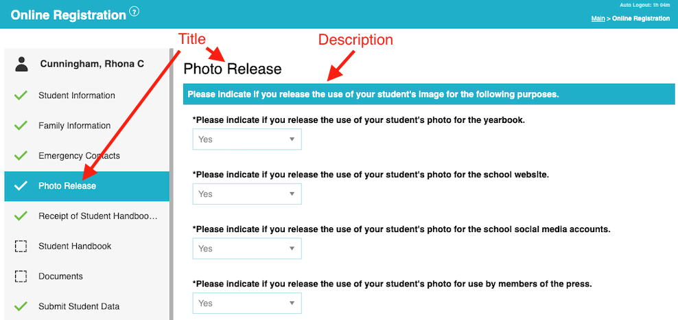
These organizational changes allowed us to improve the parent UI. Now the list of steps appears in a left sidebar on the screen. To complete registration, parents simply work through the list. As parents access each step, it is loaded into the pane on the right. Once data has been entered, a green checkmark indicates each step that is complete. This left-right design should allow parents to better understand the process.

While changing the layout, we also addressed a long standing limitation. The old version of online registration required parents to complete the entire form in one sitting. This was often impractical as the data requirements for registration are often quite extensive. Now, registration data is saved at each step. Parents can mark some steps complete, while leaving others for later. This allows parents to work on registration a chunk at a time, until it’s done.
Admin - Step Title and Description
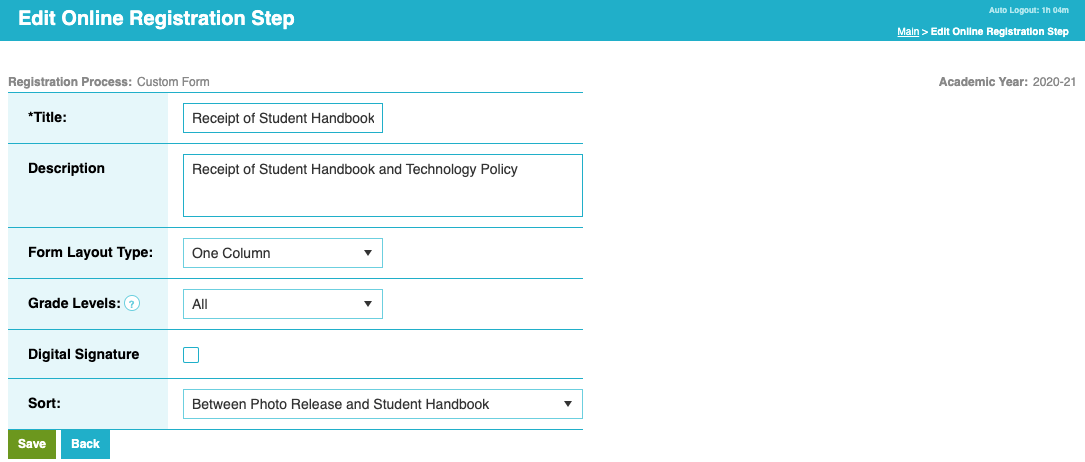
When looking at user data in the system, we noticed that many districts write lengthy directions for parents. In the previous version, we only offered one field. The descriptions didn’t display well if they were too long. So we added a short field called “title,” to give each step a small useful name. The description field still exists to hold long textual data.

We use the title in the sidebar to help parents understand the steps. Once parents start working on a step, the full description is displayed in the pane to the right.

For migration, we put the first 32 characters of the existing step description into the title. You’ll likely want to review/update the titles to optimize parent understanding of the registration process.
Admin - Preview by Contact
In addition to previewing registration for a student, we added a “Contact” mode too. Admins can search for a custodial contact and view registration for the entire family. This provides a more accurate view of the parent user experience (who frequently work on multiple students at once).

Admin - Revert Changes
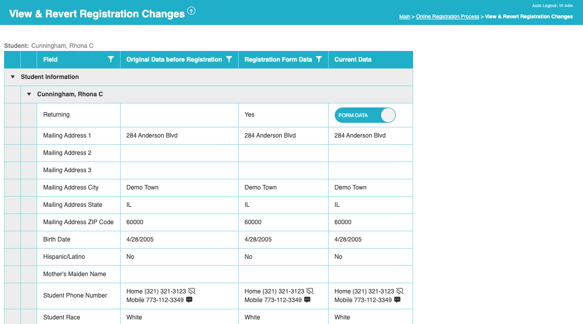
From time to time parents make mistakes when completing registration. When bad data is entered, it’s helpful for admins to have tools to manage changes. They should be able to accept newly entered data, or choose to rollback to the original data. While Online Registration has always offered the option to accept/revert, the previous version was inflexible. It offered an “all or nothing” approach where admins could revert all user changes, or accept everything.
The new “revert” tool has been expanded to allow admins to independently manage individual fields. With a finer granularity of control, some newly entered fields can be accepted while others are reverted. We think users will like the new flexibility and can better handle minor registration errors.

Beyond the above features, this release sets the foundation for future updates. We hope you like what we’ve done already and look forward to sharing more soon.
The Common Goal Team
