New Web Development Framework
4/18/2023
As web design paradigms progress, we have an opportunity to improve our products. We recently adopted a new technology framework to add interactivity, provide access to more information, and increase usability. We’re excited by this effort, and wanted to share our thoughts.
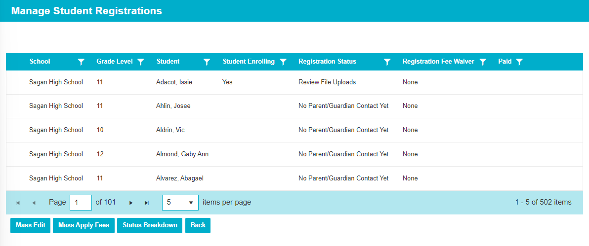
Most entities start with a “ViewAll” page that shows all rows. In the traditional layout, these were mostly static. Users could review the data and launch edit pages, but not much else. Here’s an example of a new “ViewAll” page.

The new grids (tables that show data) support filter, search, and sort. It’s easy to view rows with a particular status, grade level, etc. Look for filter icons  available on most columns.

Many filters support search too. It’s easy to find a particular row in a long list of choices, and show it in the grid. This is good for finding a single student’s data.

Clicking a column will sort the data, and most grids support multiple levels of sorting. For example, users can sort by school, then grade level, and finally student last name.

On the old pages we’d show buttons for every row, which created clutter and reduced readability. Now buttons appear as users hover the mouse over a row. Buttons are dynamic, and we can add more of them. We’ve added “hover” functionality in other places too. We’d encourage users to mouse around to discover it.

Some entities have a lot of data. In the past we were limited by horizontal space. When there was too much information, users had to navigate away to a “View” page, and come back afterwards. This meant losing their filters, sorting, and scroll position.
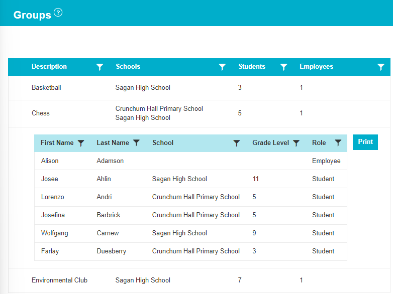
The new layouts added “details templates'' to allow users to drill down and see more information in the same space. Notice the table of students in the “Chess” group is dynamically drawn below.

Details templates give us design flexibility. Historically we’ve packed our grids with data, because it was expensive to access other pages. We are now moving infrequently used columns into details templates to improve readability. We’re having rich discussions about which columns deserve “top billing” on main grid rows, versus being in a drill down. Feel free to give us feedback as you use the new pages.
The next big change is row modification. In the past users would navigate away from “ViewAll” to a “Create” (or “Edit”) page. Changes would be made, and users would transition back afterwards. This was slow, and required frequent page reloading. Further, we’d lose users’ scroll position and filters, so they’d often struggle to find the affected row.
In the new layout, we launch modification pages on top of the existing “ViewAll.” When changes are complete, we don’t reload, since the original page is still there. We just update the edited grid row. It’s faster, and our web pages feel more application-like with increased interactivity.

In many situations, users would benefit from access to more information. So we extended the UI to support a “stack” of functionality. In the same way we loaded “Edit” on top of “ViewAll,” we can load more pages when it’s useful.
For instance, when editing a group it may be helpful to see ALL groups supervised by an employee – to inform whether they’re currently overburdened. “All Groups” stacks on top of “Edit Group” and shows additional useful information. Imagine how a deep stack of useful pages could help with complex entities.

We’re excited about making more information accessible to users. There are great creative opportunities, and we think users will love the results. Nudge us with suggestions when there’s information you wish you could access. Customer feedback will be very helpful to identify these situations.
If you’d like to look at some of our new pages, feel free to explore recent releases.
(SD)Admin Main > Groups
(SD)Admin Main > Online Registration > Manage Student Registrations
(SD)Admin Main > Online Registration > Registration Reminders
Admin Main > Grade Reporting > Historical Grades
Financials > Invoices (beta)
We hope you like our new framework. More pages will be coming soon. Feel free to send us feedback if you’d like to share your thoughts.
The Common Goal Team
